Help
The Insights screen gives you a comprehensive view of how your AI service is performing — from high-level answer completeness stats down to individual conversation threads.
The screen is built around a set of shared filters at the top, with five tabs below presenting different views of the same underlying data.
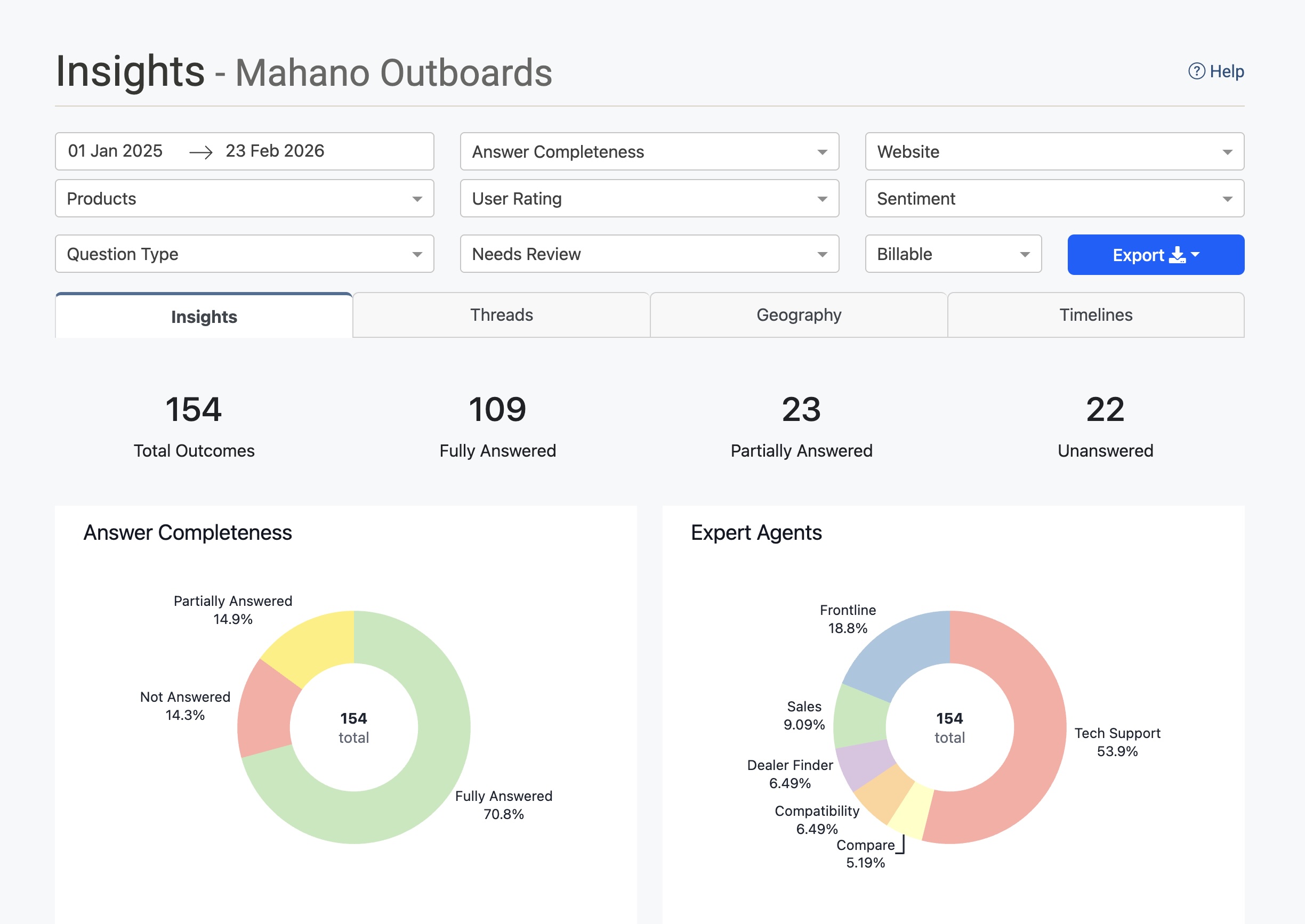
Filters
All filters apply across every tab simultaneously. The data updates when you change any filter.
| Filter | Description |
|---|---|
| Date range | The start and end dates for the data shown. Click either date to change it. |
| Answer Completeness | Filter by how completely the AI answered questions: Fully Answered, Partially Answered, or Unanswered. |
| Website | Filter to conversations originating from a specific website or deployment. |
| Products | Filter to conversations that mentioned a specific product. |
| User Rating | Filter by the thumbs up/down rating the user gave after the interaction. |
| Sentiment | Filter by the detected sentiment of the conversation: Very Positive, Somewhat Positive, Somewhat Negative, or Very Negative. |
| Question Type | Filter by the type or topic category of the question asked. |
| Needs Review | Filter to conversations that have been flagged for human review (see Review Flags below). |
| Email captured | Filter to conversations where a real visitor email was captured (not a placeholder). Names and emails are not stored in Insights. |
| Converted | Filter to conversations that matched a lead-conversion event (or did not). Historical rows with no flag count as not converted. |
| Billable | Filter by whether the interaction was billable or not. |
| Behaviour flags | For services with conversation trace logging turned on: filter to conversations where the assistant did something worth a look — Answered without searching, Search found nothing, Errors logged, Model call without a response, Response arrived late, Curated answer reworded, No answer recorded — or No trace stored. Flags are worked out from each conversation's trace shortly after it finishes (allow up to about 40 minutes), so the newest conversations may not carry them yet. Choosing several flags shows conversations with any of them. |
Insights Tab
The default tab. Shows aggregate statistics and charts for the filtered period.
Summary Stats
Four headline figures at the top of the tab:
- Total Outcomes — The total number of conversation outcomes in the selected period.
- Fully Answered — Conversations where the AI provided a complete answer.
- Partially Answered — Conversations where the AI provided a partial answer.
- Unanswered — Conversations where the AI could not answer the question.
Answer Completeness
A donut chart showing the proportion of interactions that were Fully Answered, Partially Answered, or Not Answered. Hover over a segment to see the exact count and percentage.
Use this chart alongside the Needs Review filter to identify categories of questions that are failing and may need prompt improvements or additional content.
Expert Agents
A donut chart showing how conversations were distributed across your specialist agents (e.g. Frontline, Tech Support, Sales, Dealer Finder). Each segment represents the share of total interactions handled by that agent.
This helps you understand which agents are seeing the most volume and whether traffic is being routed as expected.
Email Captured
A donut chart showing how many conversations captured a real visitor email versus those that did not. Placeholder addresses (used as a CRM key when the visitor did not give an email) count as not captured. Names and email addresses themselves are not stored in Insights — CRM remains the system of record.
Use the Email captured filter to list only conversations that did or did not capture an email.
Conversions
A donut chart showing how many conversations matched a lead conversion event versus those that did not. Conversations from before conversion tracking was enabled count as not converted.
Use the Converted filter to list only converted or not-converted conversations. Converted threads also show a badge whose tooltip is the conversion event (for example human_handoff or function_called:capture_lead).
User Feedback
A bar chart showing the count of Positive and Negative thumbs ratings submitted by users after interactions. Only rated interactions are included — unrated conversations are not shown here.
Non-Neutral Sentiment
A bar chart showing conversations with non-neutral sentiment, broken down into four categories: Very Negative, Somewhat Negative, Somewhat Positive, and Very Positive. Neutral conversations are excluded.
Use this to track how users are feeling about their interactions over time and whether specific topics are driving negative experiences.
Billable Interactions
A bar chart comparing the count of Billable versus Not Billable interactions in the selected period.
Products Mentioned
A ranked table listing the products that were mentioned in conversations, with a count of how many times each was mentioned. Sorted from most to least mentioned.
Use this to understand which of your products are generating the most customer questions.
Top Citation URLs
A ranked table listing the pages from your website that were cited most often by the AI in its responses, with a count for each. Each URL is a clickable link.
Use this to understand which content is doing the most work in supporting your AI's answers. If a page is cited frequently but also associated with a high number of Partially Answered or Unanswered outcomes, its content may need improvement.
Conversations Tab
Shows the individual conversations that match your current filters. Each row in the list represents one conversation.
Conversation List
Each conversation shows:
- Date and time — When the conversation took place, displayed in your local timezone.
- Sentiment icon — A visual indicator of the detected sentiment (positive, neutral, or negative).
- Agent badge — Which specialist agent handled the conversation (e.g. Tech Support, Sales).
- Behaviour flag badges — For traced conversations, small tags such as Answered without searching or Search found nothing (see the Behaviour flags filter). They are pointers to conversations worth diagnosing, not verdicts: an interview-style agent legitimately answers without searching, for example.
- Opening question — The first question the user asked.
- Expand/collapse — Click the row or the chevron to expand the full conversation.
Review Flags (Red Switch)
Some conversations display a red toggle switch on the right side of the row. This flag indicates that the conversation has been identified as requiring human review. A conversation is automatically flagged when one or more of the following conditions are met:
- The user gave a thumbs down rating after the interaction
- The conversation was detected as having negative sentiment
- The AI failed to answer the question (Unanswered outcome)
Use the Needs Review filter at the top of the screen to show only flagged conversations. This makes it easy to prioritise which conversations need attention.
Expanded Conversation
Click a conversation to expand it and view the full detail:
- Conversation — The full back-and-forth transcript between the user and the AI assistant.
- Citations — The URLs of any pages the AI cited in its response.
- Products — Any products mentioned or detected in the conversation.
- Visitor profile — Non-personal qualification fields (for example campus or study area) and playbook ids. Contact capture (email, name, phone) is not listed here; use the Email captured chart and filter for that. Names and emails are never shown.
- Moderations — Any content moderation actions applied to the conversation.
- Customer Location — The detected geographic location of the user.
- Website — The website or deployment the conversation originated from.
- Audio — If voice mode was used, a playback control and download button for the audio recording.
- Trace Log — For services with conversation trace logging turned on, Trace log shows how each answer was produced (which agent handled it, what was searched, what came back, the reply). Session trace covers every conversation from the same visit. Trace logs are kept for 90 days.
Diagnose with the agent
Next to the trace log buttons, Diagnose hands the conversation to the Configuration Agent. Use it when a reply looks wrong and you want to know why: the agent reads the trace, names the reply that went wrong and the stage responsible (the wrong specialist was chosen, the search missed, an instruction in the prompt caused it, the reply ignored what was found, the tone or format was off, a function call failed), and records each cause on its Diagnostics tab with the evidence.
The agent then proposes the smallest change that would fix it, in plain language, and points at the prompt or setting involved. Nothing is changed until you agree: if you ask it to go ahead, the edit appears on its Changes tab for you to review, validate and apply as usual.
When the fix is a prompt change, the agent can check it before you approve anything. It asks the assistant to compose the prompt with the draft wording and compares it with the prompt that ran in the conversation, and it can replay the reply that went wrong: the same visitor question is answered again, once with today's prompts and once with the draft change, on a throw-away conversation that is never saved, never counted in Insights or billing, and never triggers a handoff, an email or a lead. Both answers, next to what the visitor was actually told at the time, appear as a comparison card on the Diagnostics tab. Search results can differ from the original conversation because your website content may have changed since; judge the behaviour (did it search, did it cite the page, did it stop asking questions) rather than the exact words.
Two quick starts appear when it opens: Why did the assistant answer this way? runs the diagnosis straight away; Describe what went wrong lets you say which reply bothered you first (for example "in its third reply it asked another question instead of answering the fees question"), which helps the agent focus.
The button only appears when the Configuration Agent is enabled for your account. If trace logging was off when the conversation happened (or the log has expired), the agent says so, works from the transcript and a fresh search instead, marks its conclusions as inferred, and suggests turning trace logging on so the next conversation can be diagnosed properly. Bear in mind that most services rely on the general-purpose Frontline agent for most topics: the agent will not propose a new specialist agent as a fix, and it may conclude that the assistant answered as well as the website content allowed.
User Locations Tab
Displays a map showing where your users are located, based on the conversations in the selected filter period.
Conversations are plotted as circles on the map. The size and colour of each circle indicate the number of conversations from that location — larger and brighter circles represent higher volumes. A colour scale legend is shown on the right side of the map.
Use this tab to understand the geographic spread of your users, identify regions generating high volumes of questions, and inform decisions about content, language, or regional agents.
Timelines Tab
Shows how conversation volume has changed over time, broken down by answer completeness.
The chart plots the number of conversations per month with four overlapping areas:
- Total Conversations (dark line) — The overall conversation count.
- Fully Answered (green) — Conversations with complete answers.
- Partially Answered (yellow) — Conversations with partial answers.
- Unanswered (red/pink) — Conversations the AI could not answer.
Use this tab to spot trends — for example, a spike in Unanswered conversations following a product launch may indicate the AI needs updated content.
Demand Tab
The Demand tab shows what people asked, organised as Taxonomy Categories, Semantic Themes, or Voice of Customer (who asked, when visitor profiles are enabled).
Use View by to switch between those reports. The date range and filters at the top of Insights still apply.
Export
Click the Export button (top right of the filter bar) to download the data matching your current filters. Two formats are available:
- as CSV — A plain comma-separated file, compatible with Excel, Google Sheets, and most data tools.
- as XLS — A Microsoft Excel workbook.
The export includes conversation-level data for all threads matching the active filters, making it suitable for offline analysis, reporting, or sharing with stakeholders. Visitor profile reporting columns include captured_email (true/false), playbook_ids, non-personal profile_* fields, and visitor_profile_report as JSON. Names and email addresses are not included.